On Colors (3)
Find the whole series "On colors" here.
Here is how I began to study colors with my very own approach. I needed something more practical than rules defined by others for other uses than mine. I needed to find the equivalent of mixing colors on a palette, and to go through my own culture and gathered corpus of lovely picture.
I took my iPad , and a few color apps. I used successfully Palettes Pro and Adobe® Color Lava for Photoshop® and tested some others ...I liked Palette Pro because it can extract colors from a picture, and Color Lava is fun because I can use the colors in Photoshop via Wifi. It's not really practical but real fun in a happy geeky way.
So what I did first is take my favorite pictures ever and extract the colors I loved. 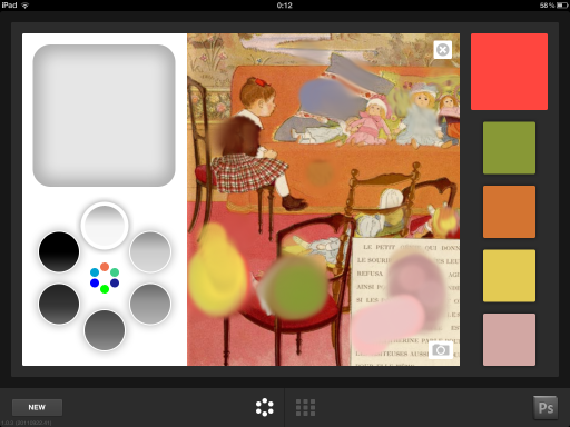
Here is a lovely illustration by Boutet de Monvel on Adobe Color Lava. Boutet de Monvel was a very well known French children illustrator in the first part of the 20th century. I love his pictures since I was a little girl. So it was a good place to start!
For months I analyzed loved pictures and discovered two important things:
1.That 5 colors is enough to make a picture, but usually not enough. Most of my illustrations have more than 5 colors . I had to combine palettes or add colors.
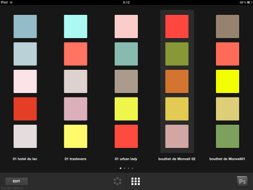
2. That color analysis app are great tools, but they don't give you the proportions to use. Like, if there is a large amount of red in a picture and very little blue and yellow, you will still extract samples the same size. I don't find it helps me choosing colors. I learned to make moodboards instead of palettes, so I could get the inspiration I needed. Colors is about proportions, contrast and accents. Pinterest is a great tool for color hunting : see what I gathered here.
I also used the application moodboards on my iPad.
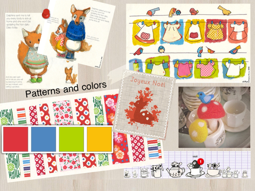
Here is a sample I made for you, so you can get an idea : of course I don't use my own pictures usually.
Because colors depend on language a lot I also made research on color names in both my languages : corail, Kelly green, puce...I also learned that translation doesn't work so well: Khaki is not the same color in French and English. I began to translate colors in different languages to google them and get even more ideas.
This is how I learned more about colors and how I use them my way. But that's a lot of work and studying. I understand more and I am able to understand even more by association. It was a long and pleasant way and I am still working on it. Learning teaches you to be curious and make your own conclusions, and in a world of preprocessed foods and informations it's a very good thing.
But I also came up with a good, fast way to create interesting palettes, and I will tell you more about it next time!